Introducing the MAFL Team Dashboard (Round 9)
/In the previous blog I promised to provide another dashboard, this one devoted to information about team performance.
Try as I might, I couldn't come up with any charts for this dashboard that seemed to be of any interest, so the final dashboard is, I admit, something of a festival of text and digits with nary a relieving picture in sight. If Gordon Gecko had been a quant jock, I'm sure he'd have proclaimed that "Charts are for wimps" anyway.
So, here 'tis.
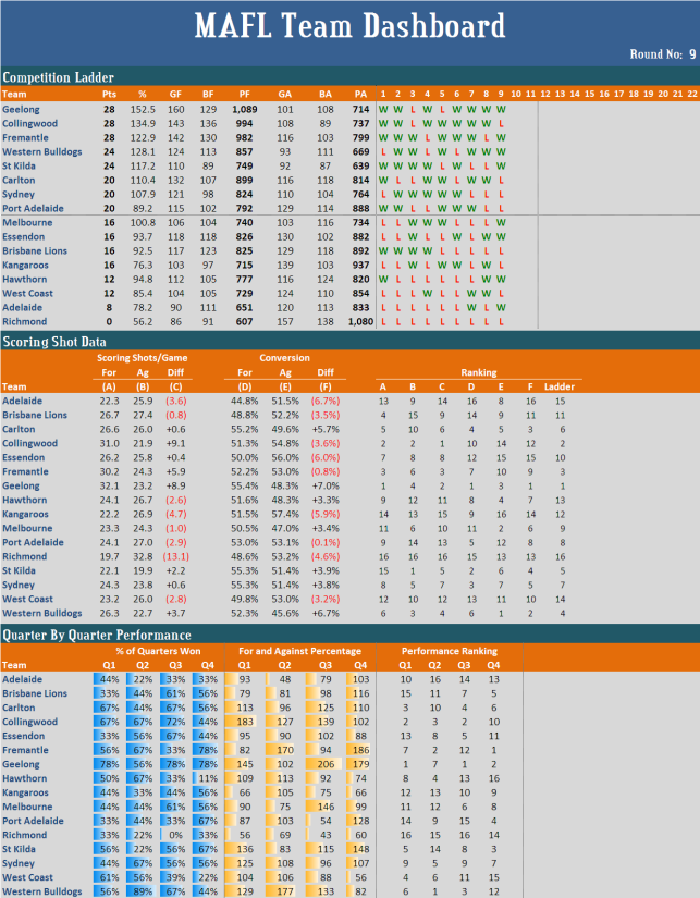
The first section of the dashboard provides information similar to that you'll get from a standard competition ladder, but enhances it by providing statistics of Goals For (GF), Behinds For (BF), Goals Against (GA) and Behinds Against (BA), as well as the match-by-match Win-Draw-Loss performance of each team.
From this section you can see that Geelong have scored more goals than any other team (they've scored 160), and that Collingwood have scored more behinds than any other team (they've scored 136). You can also see - as I've noted in a previous blog - how remarkable is the performance of St Kilda who, while they occupy fifth spot on the ladder have scored only 110 goals, fewer than any other team in the top eight, but have also allowed only 92 goals, the fewest of any team in the competition.
You can also see that only four teams have won their previous two encounters: Geelong (who won their previous four), the Dogs (three), Essendon (two) and Hawthorn (also two).
The second section of the Team Dashboard contains information about each team's scoring shot production and those of its opponents'.
Here you can see that Geelong have recorded the highest number of scoring shots per game (32.1) and that St Kilda have conceded the fewest per game (19.9). As well, Geelong, narrowly, have the highest conversion rate of scoring shots into goals at 55.4% and that Adelaide have the lowest conversion rate at just 44.8%.
In terms of opponents' conversion rates, the Dogs are best. Their opponents have converted at a rate of just 45.6%. Worst on this metric are the Roos, whose opponents have converted 57.4% of scoring shots into goals.
The rightmost block of this section provides each team's ranking on the metrics in the columns labelled A through F and, for comparison, each team's ladder position.
Here you can see that Collingwood have managed to claw their way into second on the ladder despite having only the tenth best conversion rate and the fourteenth best opponent conversion rate (where a higher ranking relates to a lower conversion rate). Similarly, Freo, who are third on the ladder, have only the seventh best conversion rate and the tenth best opponent conversion rate.
A couple of other rankings are interesting. Hawthorn, thirteenth on the ladder, have the eighth best conversion rate and the fourth best opponent conversion rate. What's hurting them is the failure to generate scoring shots: they're ninth on this metric. Also, Melbourne, who are ninth on the ladder, are second on opponent conversion rate.
In the final section, labelled Quarter By Quarter Performance, I've included information previously provided under the "Alternative Premierships" designation. It's the only section of the dashboard where I've made a cursory nod to charting proponents, and I can't promise that the charting elements will stay.
The leftmost columns of this section provide information about each team's performance by quarter. Here you can see that no team has won a particular quarter in each of its nine matches. The best any team has achieved is an 8 from 9 (89%) record, which is what the Dogs have done in second quarters. In contrast, there is a team that's managed to lose a particular quarter in every game: Richmond in third quarters.
Next in this section is information about each team's for and against performance by quarter. Here you can see that Adelaide have struggled in second quarters in particular, scoring less than one half of the points they've conceded in this quarter, as well as how dominant the Cats have been in every quarter bar the second.
These insights are even more obvious if you review the rightmost columns in this section, which provide each team's ranking for each quarter, where ranking is based firstly on quarters won (with drawn quarters counting half) and then on percentage where ties need to be broken.
Here too you can see Adelaide's second-quarter weakness and Geelong's first-, third- and fourth-quarter dominance. You can also see Carlton's and St Kilda's relative weakness in second quarters, the Dogs' relative weakness in final terms, as well as the Lions' poor showing in the first two quarters when compared with its performance in the final two quarters, and the Hawks' and Eagles' strong showing in the first two quarters versus those in the final two quarters.
I'm sure there's a lot more you can spot too if you study the dashboard for awhile.
My goal now is to produce this dashboard each Monday or Tuesday night and the MAFL Dashboard each Sunday night. I do hope they provide you with something interesting to review.